6. SmartBrief / Brief Page
Note
Access to SmartBrief requires an Australia or New Zealand subscription.
SmartBrief provides NOTAMs and various weather briefings in a graphical, interactive, and easy to use format.
In the lower left corner of the screen you will find 5 buttons. The top 3 buttons are used to navigate between the 3 main screens in SmartBrief, these are:
Graphical Area Forecasts (GAFs)
The remaining 2 buttons are used to open the Chart Directory, and the Help screen.
6.1. NOTAMs & Airspace
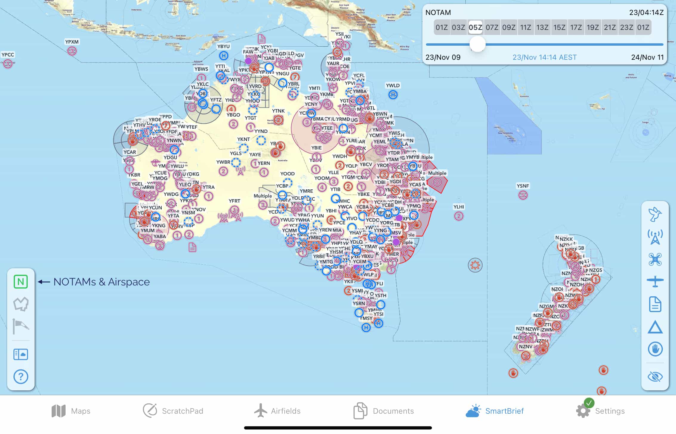
Where possible, NOTAMs are drawn geographically on the map and are sorted into categories, indicated by different symbols. These categories can be filtered (switched on/off) using the buttons on the right sidebar, as shown in Image 6.1 below.
Tap on a category symbol to show/hide the corresponding NOTAMs on the map.

Image 6.1 NOTAM categories
The function of the NOTAMs for Plan and Hidden NOTAMs buttons are described further down.
Tap on any NOTAM on the map to view the full details and reveal some further options. If the NOTAM encompasses a geographic area this is represented on the map, as is the case in Image 6.2 where a circle of 1km radius appears around Bordertown (YBOR) as per the content of the NOTAM.
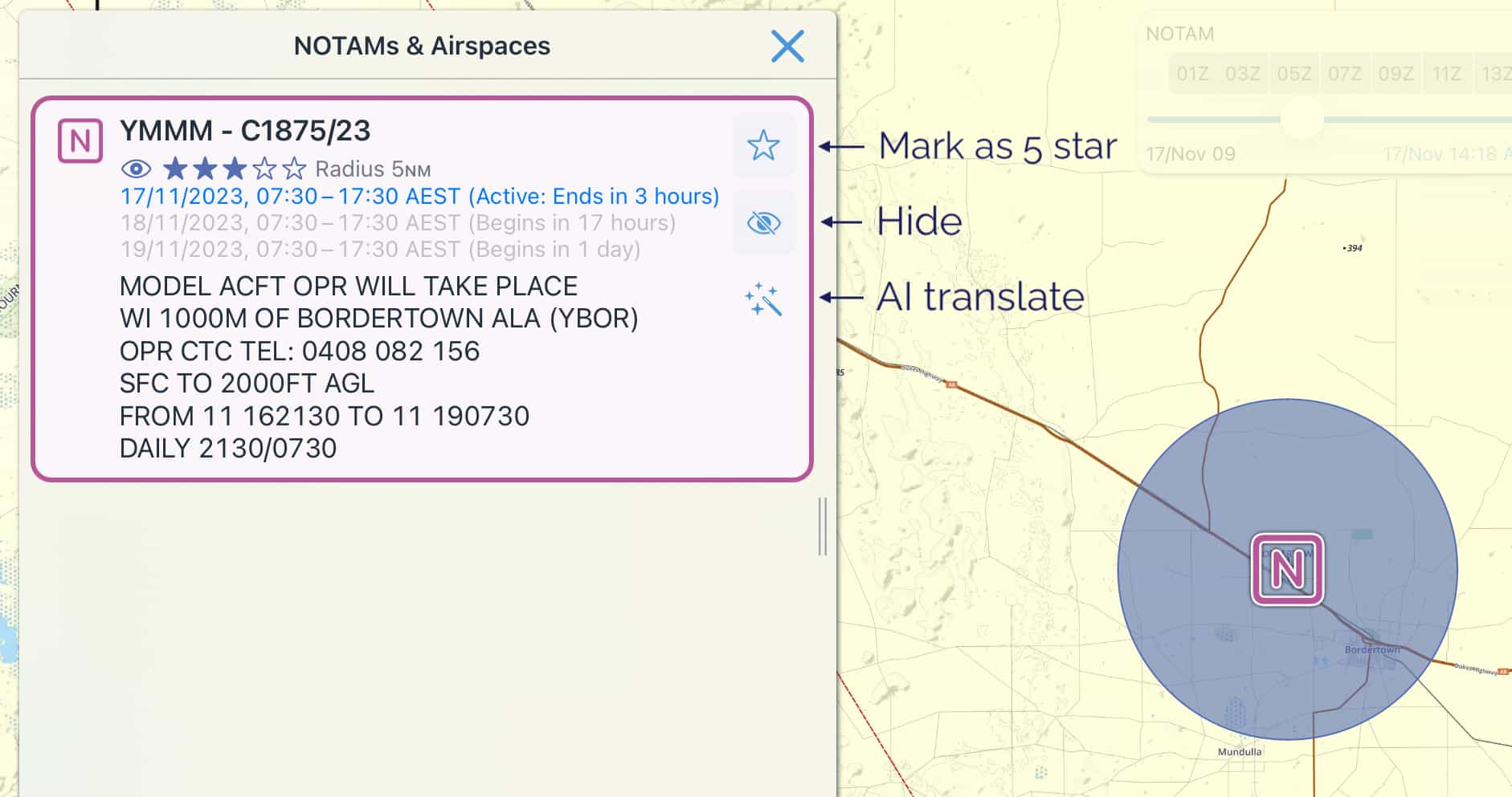
Image 6.2 NOTAM options
Next to each NOTAM there are 3 options:
- Mark as 5 star
Give this NOTAM a 5 star rating. 5 star rated NOTAMs are highlighted red on the map, annotated with 5 stars ☆☆☆☆☆, and sorted to the top of any lists they appear in (with the exception of the NOTAMs for Plan and Route Segment Profile lists, which are sorted in order of occurrence, geographically, from origin to destination.)
- Hide
Hiding a NOTAM removes it from the list and also from the map display. You can view and/or unhide NOTAMs in the Hidden NOTAMs list.
- AI translate
Translate a NOTAM into plain English, powered by Artificial Intelligence (AI). In essence, the computer makes its best guess in translating the NOTAM. Use cautiously. If in doubt, verify with the NOTAM originator.
NOTAMs for airfields
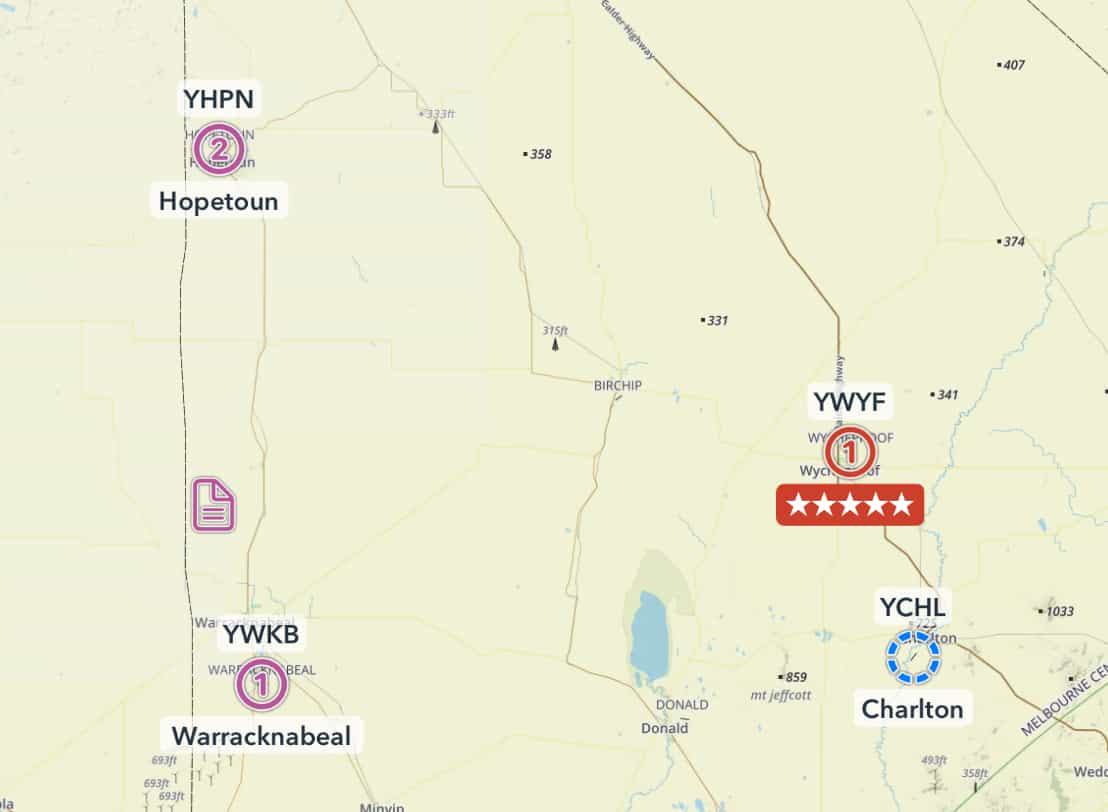
Image 6.3 NOTAMs for airfields
Aerodromes/airfields that have associated NOTAMs are depicted by the NOTAM count appearing inside the airfield icon. Locations with one (or more) 5 star NOTAMs are highlighted red.
For example in Image 6.3 Charlton has 0 NOTAMs, Warracknabeal has 1, Hopetoun has 2, and Wycheproof (YWYF) has 1 NOTAM with a 5 star rating.
Tap on the airfield/aerodrome to view the NOTAMs.
NOTAMs for Plan
The ‘NOTAMs for Plan’ button is only shown when you have created/opened a flight plan in OzRunways. The list is populated with NOTAMs and airspace relevant to your plan within your selected LSALT splay. By default this is everything within 5NM (RNP2) either side of your planned track, however this can be changed to a different splay type in the Map View Options (Cogs) → Show LSALT Boundaries list.
NOTAMs in this list are sorted in order of occurrence, geographically, from the start to the end of your plan. They are not sorted in order of importance/star rating.
For more information about the symbols/buttons next to each NOTAM see Image 6.2 above.
Route Segment Profile
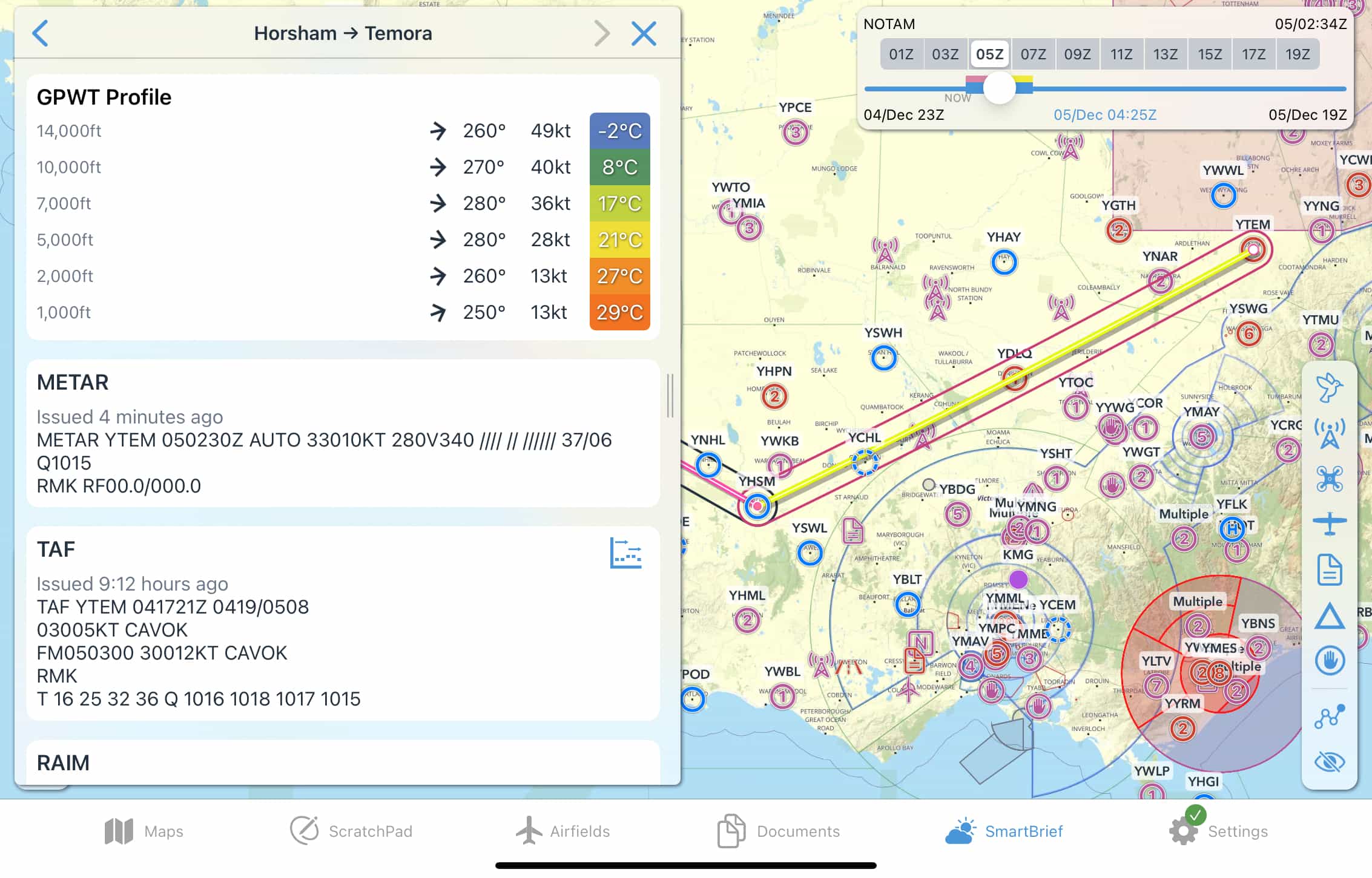
- Tap on a route segment / leg to open a profile view which displays a number of items:
GPWT profile for varying altitudes/flight levels, taken from the mid-point of the route segment
Applicable ATIS / eAWIS / METAR / TAF / RAIM etc. briefings
A list of NOTAMs that intersect the selected route segment and associated splay. As in NOTAMS for Plan this list is sorted in order of geographic occurrence, not importance/star rating.
Time slider
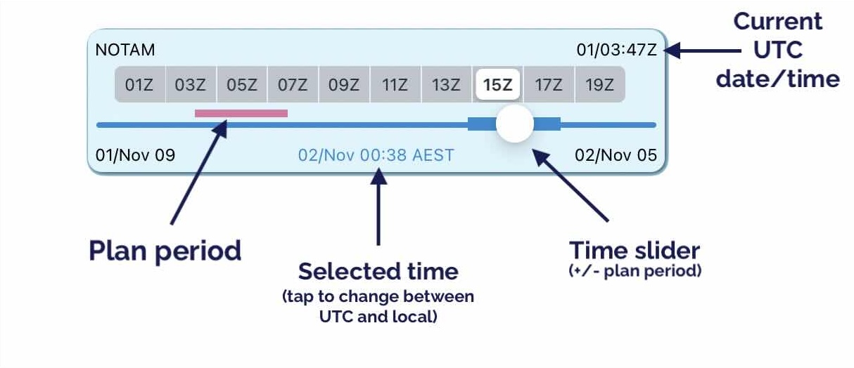
Use the time slider located in the top right corner to select the activity period you want to view. If you have entered or opened a plan you will see a magenta line above the slider indicating your total plan time (plan period), and a thick blue line either side of the slider also corresponding with your plan period.
As you move the slider you will notice different airspaces & NOTAMs becoming active/inactive corresponding with the selected time, including the plan period if applicable. If you have a list of NOTAMs open you will notice any inactive NOTAMs for the selected time will be greyed out.
The selected time is shown in the bottom middle of the time slider box, tap on the time once to switch to local time. Tap again to change back to UTC time.
Double tap anywhere inside the box to return the slider to the middle of your plan time (based on the ETD you have set for your plan). If no plan is loaded a double tap will return the slider to ‘now’.
The current UTC date/time is always displayed in the top right corner of this box for your reference.
As mentioned before, if you have an active plan in OzRunways a magenta line is displayed above the slider to give you an indication of times relevant to you. For best results, ensure you have correctly set your ETD for your plan.

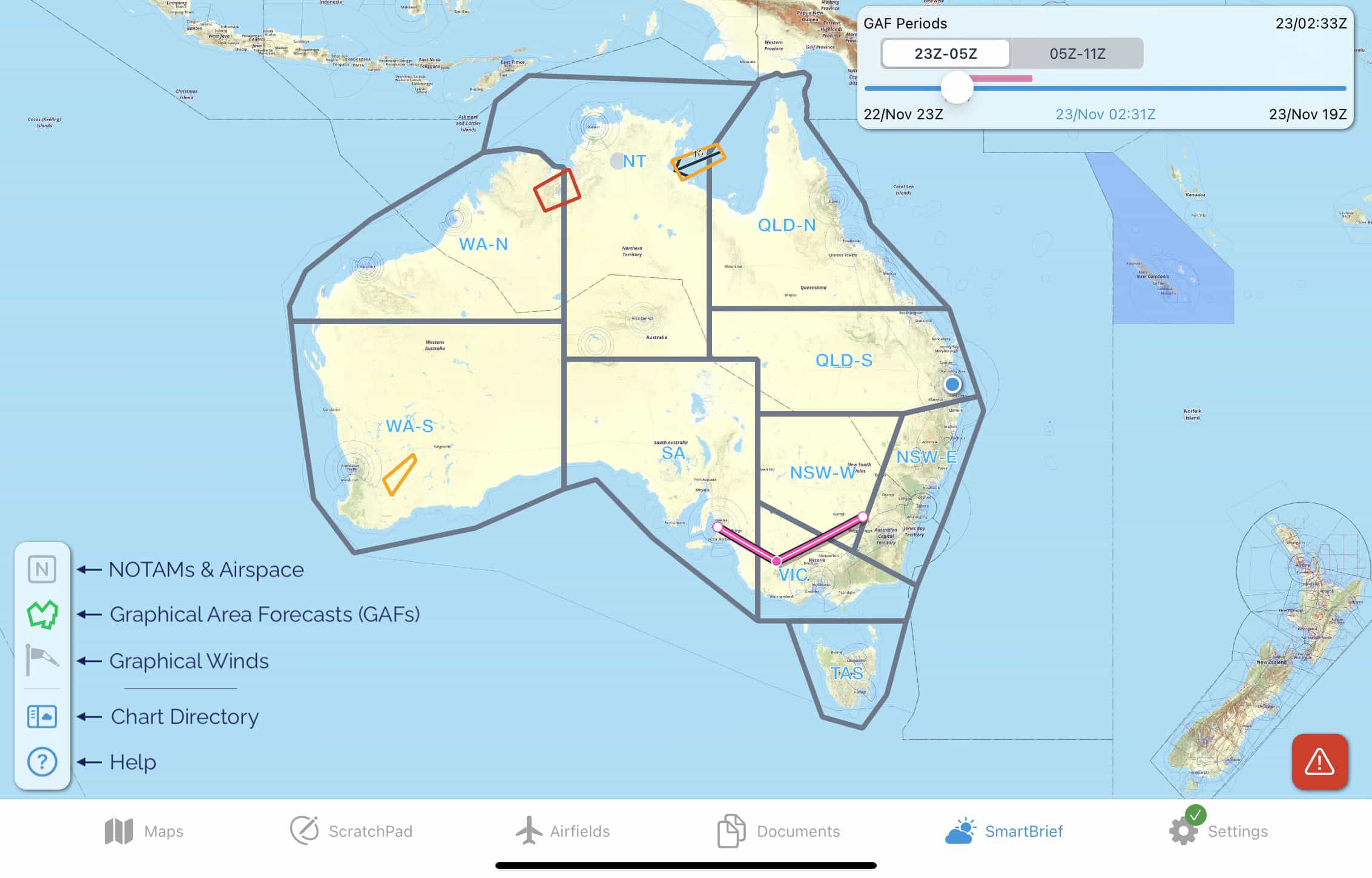
6.2. Graphical Area Forecasts (GAFs)
Note
The Graphical Area Forecasts (GAFs) screen is only available to Australian subscribers.
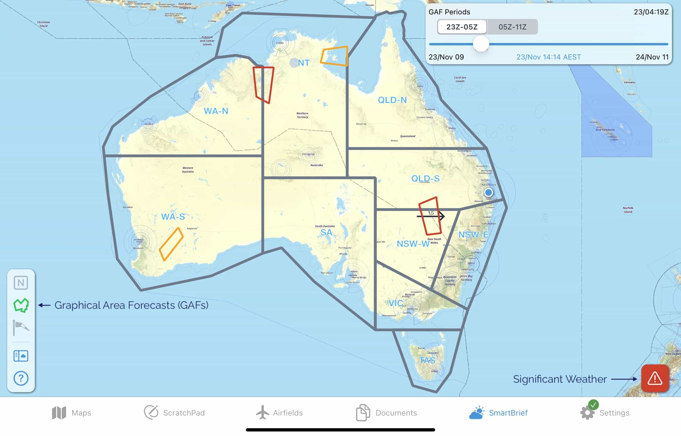
Zoom in to the map to see more detail. You will notice that the GAF regions and areas are drawn on the map. Tap on an area to bring up the forecast text, as shown in Image 6.4
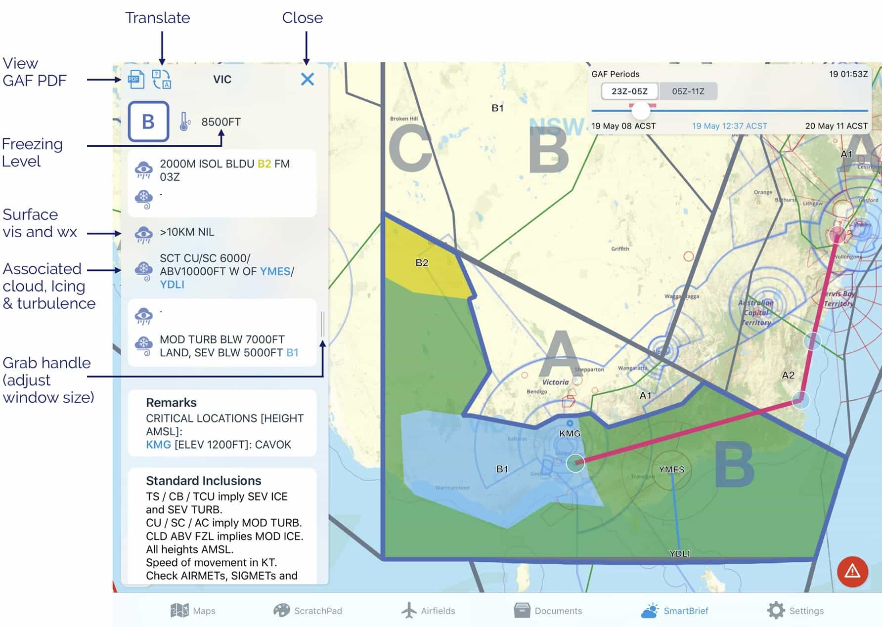
Image 6.4 GAF in SmartBrief
Coloured items in the forecast text are tappable (for example, in the image above ‘B2’, ‘YMES/YDLI’ and ‘B1’ can be tapped on). When tapped, the text and the corresponding depiction on the map will turn orange to help you locate it. You can adjust the size of the text box by sliding the grab handle. Surface vis and wx, along with associated cloud, icing and turbulence is depicted. Use the ‘X’ to dismiss the text box. There is a PDF button to load the original GAF PDF.
The translate button converts the acronyms to plain text (as shown in Image 6.5)
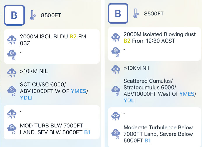
Image 6.5 GAF text translated
In the top right corner of the page is the time slider box (Image 6.6)
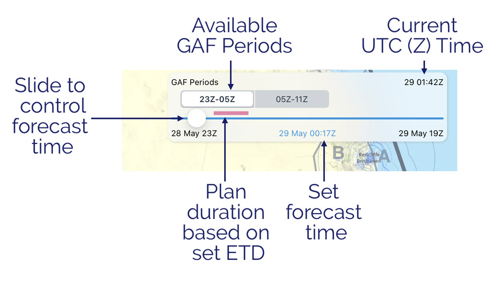
Image 6.6 Time slider
Use this slider to control the forecast period you want to view. Periods where a GAF is available are shown as boxes, tap the boxes to automatically jump the slider to the relevant time period. Tap once in a blank section of the box to change to local time. Tap again to change back to UTC time. Double tap inside the box to return the slider to the middle of your plan (based on the ETD you have set for your plan). The current UTC time is always displayed in the top right corner of this box for your reference. If you have a plan loaded a magenta line is displayed above the slider to give you an indication of what forecast times are relevant to you. Make sure you have your ETD set correctly in the plan for this to work.
Significant Weather (SIGMETs & AIRMETs)
If there are any SIGMETs or AIRMETs valid for the selected time they will be drawn on the map in red (SIGMETs) or yellow (AIRMETs). Tap on a SIGMET or AIRMET to view more information.
Tap the Significant Weather button to see a list of all SIGMETs and AIRMETs valid within the set forecast time. You can tap a SIGMET or AIRMET in the list and it will become highlighted on the map. The Significant Weather button is not shown if there are no valid SIGMETs or AIRMETs for the set forecast time.
Note
If for any reason a SIGMET or AIRMET shape cannot be drawn on the SmartBrief map, a warning will appear prompting you to check the list.
Location Briefings
To access location briefings zoom in on the map until the location waypoints appear. Tap a location to bring up the briefing. Image 6.7 shows the location briefing for YORG (Orange). Once again there is a translate button but please note that at this stage only the TAFs can be translated.
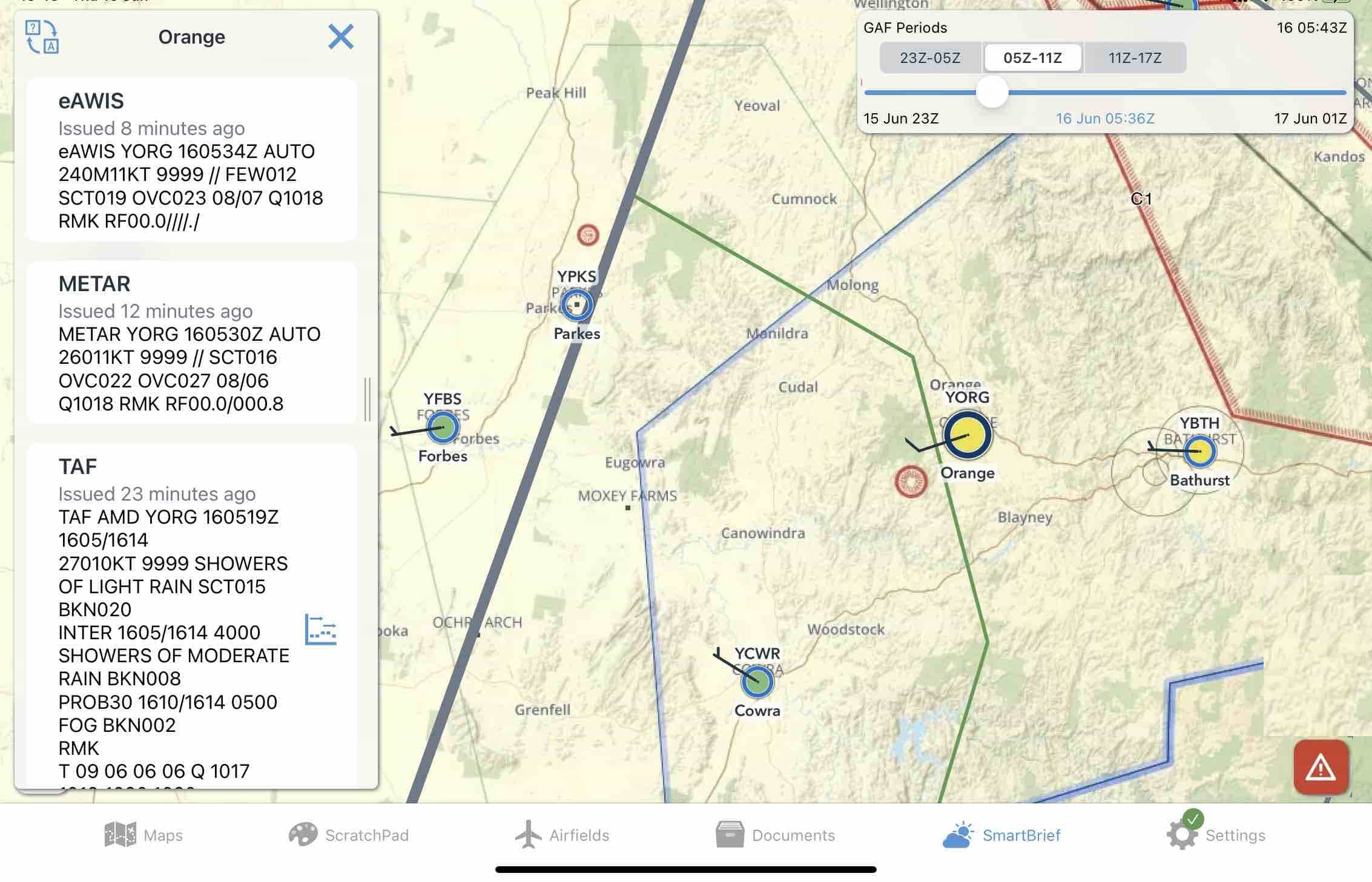
Image 6.7 Location Briefing in SmartBrief
eAWIS is created from unverified one-minute observation data from BoM. For situational awareness only.
Locations that have an eAWIS/METAR available will be colour coded according to the observed meteorological conditions. The criteria for the colours is shown in Image 6.8 below. Where wind data is available a wind indicator is also shown on the waypoint, with each full barb indicating 10kts and a half barb indicating 5kts.
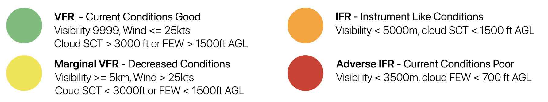
Image 6.8 METAR/eAWIS colour coding
6.3. Graphical Winds
Switch to the Graphical Winds page by pressing the windsock in the bottom left corner.
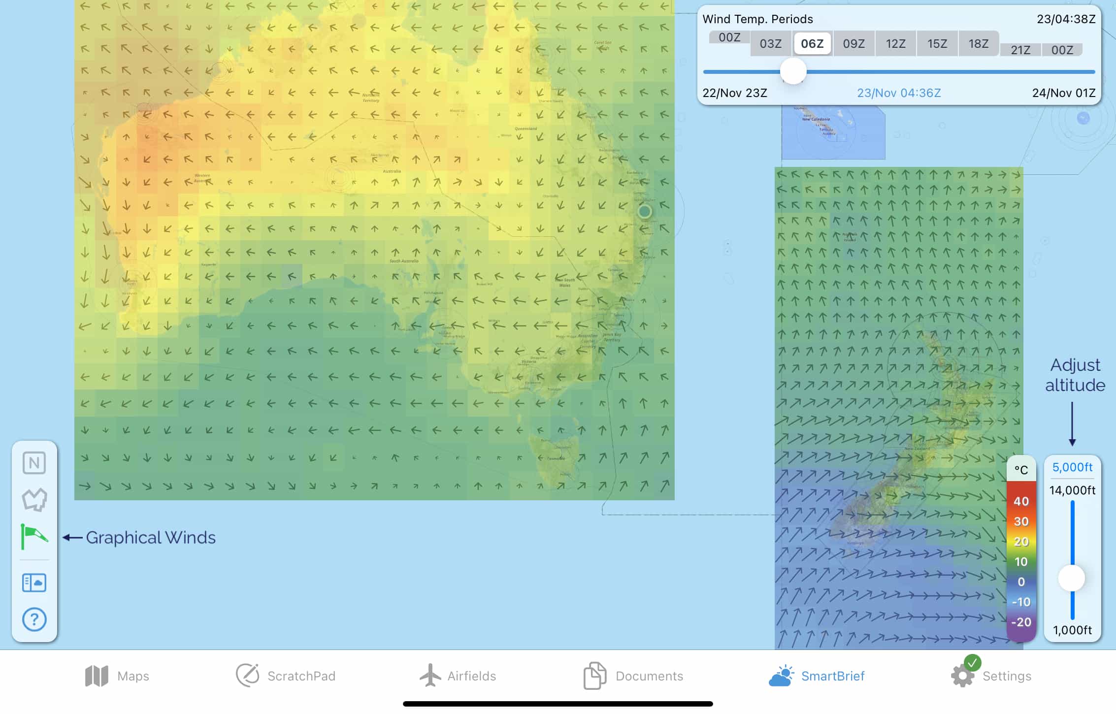
Image 6.9 Graphical Winds overview
The coloured boxes give a graphical representation of the data from the Grid Point Wind & Temperature charts (Australia), or the Global Forecast System (GFS) data (New Zealand). The colour indicates temperature corresponding with the colour scale in bottom right corner, and the arrow represents wind direction and strength; the longer the arrow the stronger the wind. Zoom in to see the actual figures for each square, as shown in Image 6.10. The figures are interpolated for altitude and time.
Use the slider in the bottom right corner to adjust the altitude. The selected altitude in Image 6.10 is 5000ft. Use the time slider in the top right corner to adjust the forecast time you want to view. The available wind forecast periods are pre-filled in tappable boxes above the slider so that you can easily switch between them.
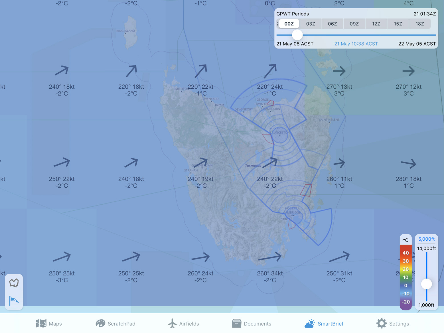
Image 6.10 Graphical Winds in more detail
6.4. Chart Directory
In the Chart Directory you can find various charts produced by different meteorological authorities, along with the original PDF versions of the GAFs, GPWTs, and SIGWX charts.
New Zealand subscribers can access ‘PreFlight’ from here.
6.5. Basic Brief
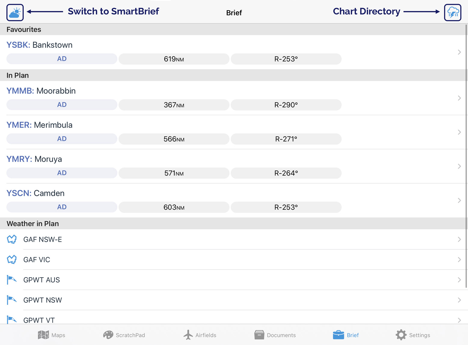
Image 6.11 Basic brief
Basic Brief provides easy to access weather and NOTAM information relevant to your route in one place.
Favourites
If you have set up any Favourites on the Airfields Page (see Favourites), then those airfields will be displayed at the top of the Basic Brief page for quick access to their location briefings.
In Plan
If you have a plan entered then all the airfields in your plan will be displayed in the list underneath the Favourites section. Tap an airfield to load the location briefing.
Weather in Plan
The Weather in Plan section is only displayed when you have a plan entered. This section provides Area Briefings, GAF, and GPWT charts relevant to the areas your plan crosses. Tap an item in the list to view the chart or briefing.
Other Weather Charts
The button in the top right corner opens the Chart Directory screen. Here you can find various charts produced by different meteorological authorities, along withs PDF versions of the GAFs, GPWTs, and SIGWX charts.
Troubleshooting
The option to switch between Brief and SmartBrief will appear by pressing and holding the ‘Brief’ icon in the menu bar.
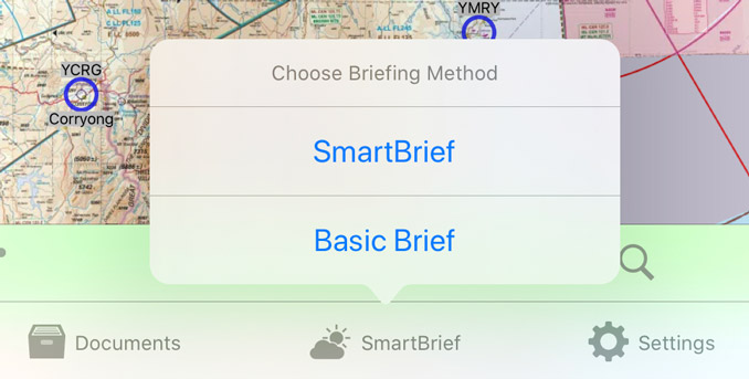
Image 6.12 Switch between ‘Brief’ and ‘SmartBrief’