5. Brief (or SmartBrief) Page
Access to SmartBrief requires an Australia or New Zealand subscription.
For all other subscribers see Basic Brief at the bottom of this page.
5.1. SmartBrief
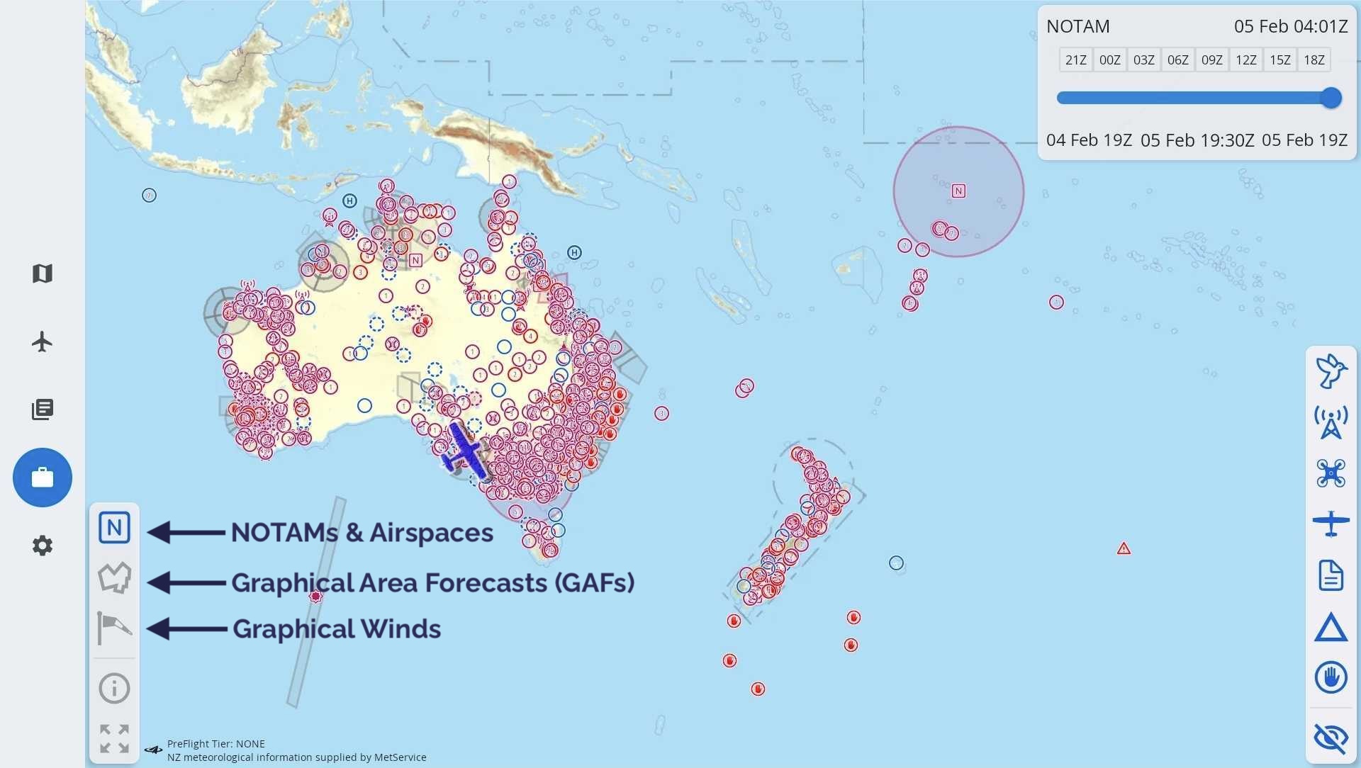
Image 5.1 SmartBrief overview
SmartBrief is an interactive map that combines a variety of different weather and NOTAM sources. You can access NOTAMs and AirspaceGraphical Area Forecasts (GAF), NAIPS location briefings, SIGMETs, AIRMETs, Grid Point Wind & Temperature (GPWT) and more. Access SmartBrief from the Brief page by tapping “SmartBrief” in the top right corner.
The sections below describe how to interact with the various elements of SmartBrief.
In the lower left corner of the screen you will find 5 buttons. The top 3 buttons are used to navigate between the 3 main screens in SmartBrief, these are:
Graphical Area Forecasts (GAFs)
There is a ‘full screen’ button in the bottom left corner which hides the top and bottom menu bars. The (i) shows when the weather and NOTAM information was last updated and allows you to check for any further updates, see Time Slider for more information. If you have a plan active your route is displayed as a magenta line.
5.2. NOTAMs & Airspace
Where possible, NOTAMs are drawn geographically on the map and are sorted into categories, indicated by different symbols. These categories can be filtered (switched on/off) using the buttons on the right sidebar, as shown in Image 5.2 below.
Tap on a category symbol to show/hide the corresponding NOTAMs on the map.
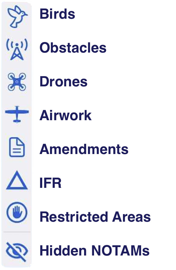
Image 5.2 NOTAM categories
The function of Hidden NOTAMs is described further down.
Tap on any NOTAM on the map to view the full details and reveal some further options. If the NOTAM encompasses a geographic area this is represented on the map, as is the case in Image 5.3 where a circle of 35nm radius appears around Beverley Mine (YBEE) as per the content of the NOTAM.
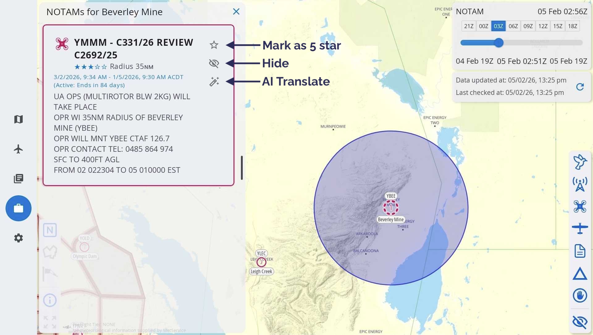
Image 5.3 NOTAM options
Next to each NOTAM there are 3 options:
- Mark as 5 star
Give this NOTAM a 5 star rating. 5 star rated NOTAMs are highlighted red on the map, and sorted to the top of any lists they appear in.
- Hide
Hiding a NOTAM removes it from the list and also from the map display. You can view and/or unhide NOTAMs in the Hidden NOTAMs list.
- AI translate
Translate a NOTAM into plain English, powered by Artificial Intelligence (AI). In essence, the computer makes its best guess in translating the NOTAM. Use cautiously. If in doubt, verify with the NOTAM originator.
NOTAMs for airfields
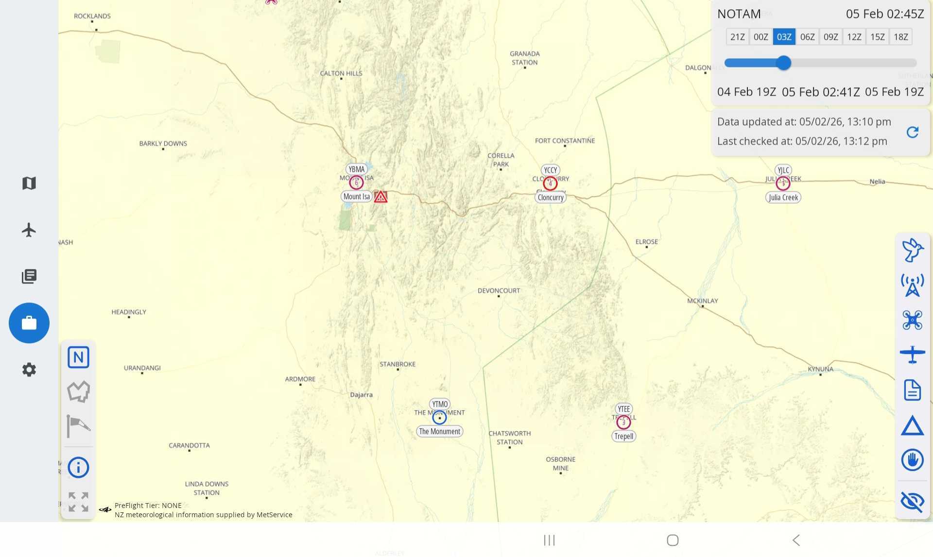
Image 5.4 NOTAMs for airfields
Aerodromes/airfields that have associated NOTAMs are depicted by the NOTAM count appearing inside the airfield icon. Locations with one (or more) 5 star NOTAMs are highlighted red.
For example in Image 5.4 The Monument (YTMO) has 0 NOTAMs, Julia Creek (YJLC) has 1, Trepell (YTEE) has 3, Mount Isa (YBMA) has 6 and Cloncurry (YCCY) has 4 NOTAMs and at least 1 with a 5 star rating.
Tap on the airfield/aerodrome to view the NOTAMs.
Time slider
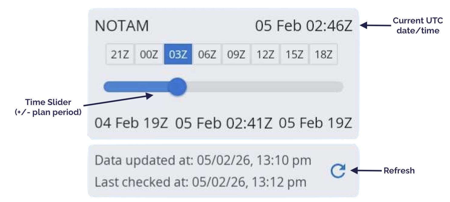
Use the time slider located in the top right corner to select the activity period you want to view.
As you move the slider you will notice different airspaces & NOTAMs becoming active/inactive corresponding with the selected time. If you have a list of NOTAMs open you will notice any inactive NOTAMs for the selected time will be greyed out.
The selected time is shown in the bottom middle of the time slider box, tap on the time once to switch to local time. Tap again to change back to UTC time.
The current UTC date/time is always displayed in the top right corner of this box for your reference.
When the (i) in the bottom left corner has been selected on, the SmartBrief Info View will appear below the time slider. This box displays when NOTAM and weather data was last updated (Data updated) and when this data was last confirmed to be correct (Last checked). You can force a data update and check by tapping the refresh button.

5.3. Graphical Area Forecasts (GAFs)
Zoom in to the map to see more detail. You will notice that the GAF regions and areas are drawn on the map. Tap on an area to bring up the forecast text, as shown in Image 5.5
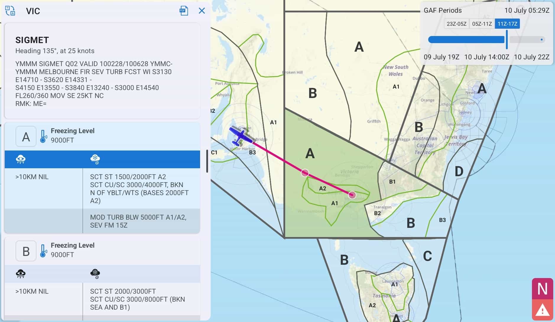
Image 5.5 Viewing a GAF in SmartBrief
Surface vis and wx, along with associated cloud, icing and turbulence is depicted. Use the ‘X’ to dismiss the text box. There is a PDF button to load the original GAF PDF.
In the top right corner of the page is the time slider box (Image 5.6)
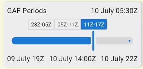
Image 5.6 Timeslider
Use this slider to control the forecast period you want to view. Periods where a GAF is available are shown as boxes, tap the boxes to automatically jump the slider to the relevant time period. The current UTC time is always displayed in the top right corner of this box for your reference.
Translate Airfield Weather Text
Zoom into the map in SmartBrief to view ALA. Tap an airfield to view the weather (METAR, TAF, RAIM, NOTAM) specific to that airfield. The translate button located on to top left corner of the popup converts the acronyms to plain text as shown in (Image 5.7)
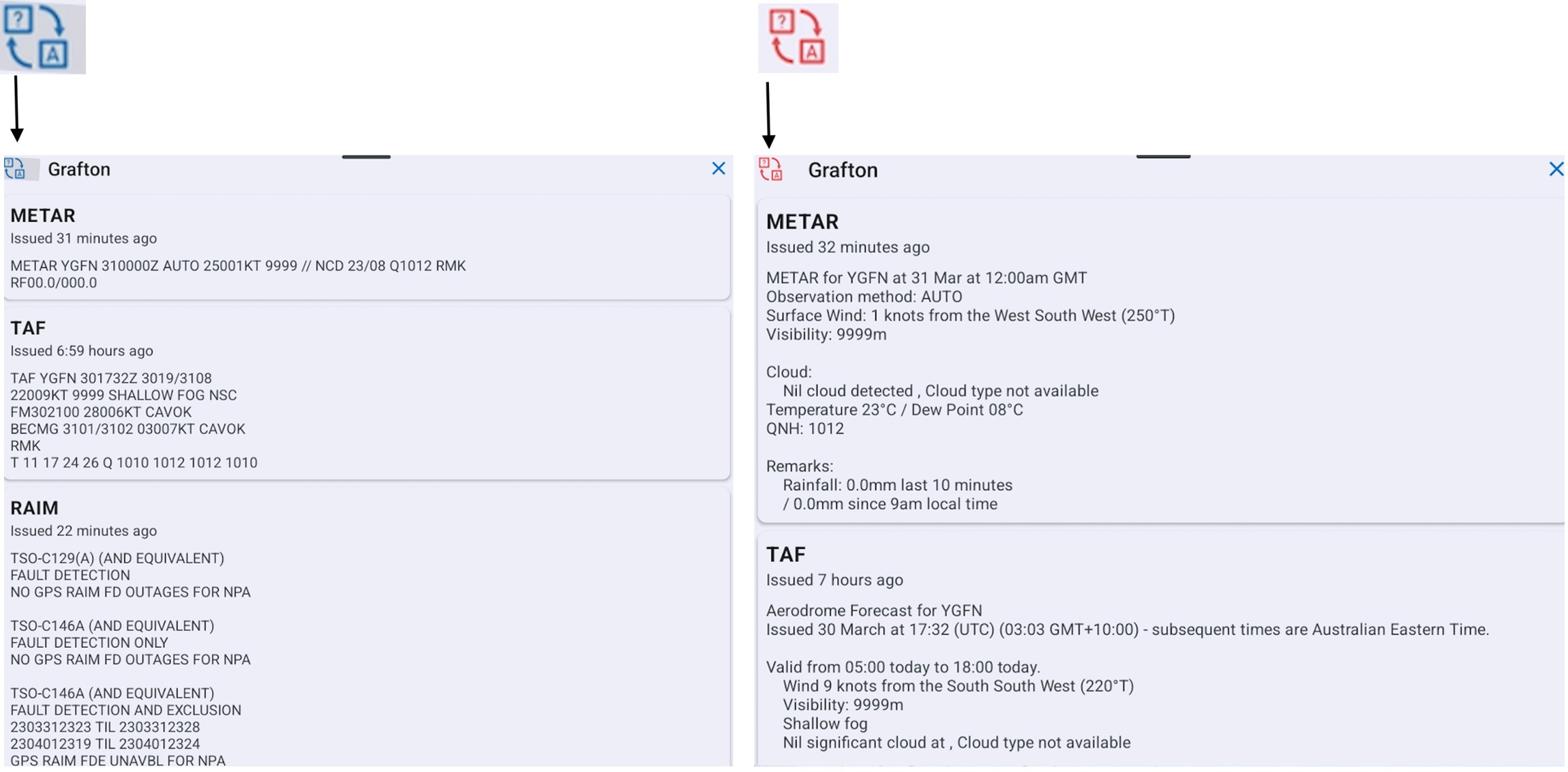
Image 5.7 Translated Text
5.4. NOTAMs for Plan
The ‘NOTAMs for Plan’ button (magenta circle with the letter ‘N’, bottom right corner) is only shown when you have a plan loaded. Tap to see a list of NOTAMs relevant to the airfields and areas contained in your plan. For more information about the symbols next to the NOTAMs see NOTAM grading system further down.
5.5. Significant Weather (SIGMETs & AIRMETs)
If there are any SIGMETs or AIRMETs valid for the selected time they will be drawn on the map in red (SIGMETs) or yellow (AIRMETs). Tap on a SIGMET or AIRMET to view more information.
Tap the Significant Weather button to see a list of all SIGMETs and AIRMETs valid within the set forecast time. The Significant Weather button is not shown if there are no valid SIGMETs or AIRMETs for the set forecast time.
Note
If for any reason a SIGMET or AIRMET shape cannot be drawn on the SmartBrief map, a warning will appear prompting you to check the list.
5.6. Location Briefings
To access location briefings zoom in on the map until the location squares appear. Tap a location to bring up the briefing. Image 5.8 shows the location briefing for YORG (Orange).
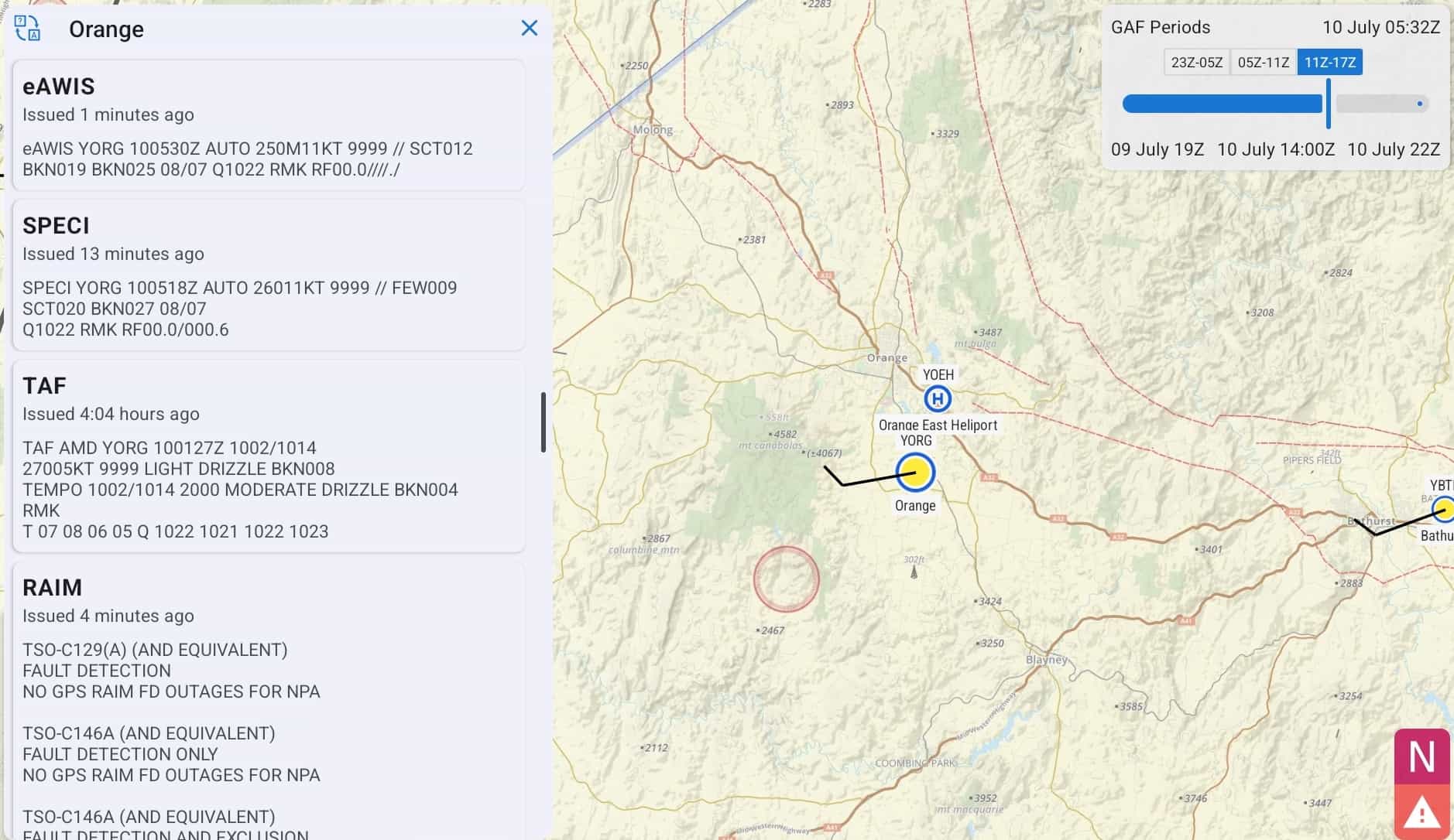
Image 5.8 Location Briefing in SmartBrief
NOTAM grading system
There are two symbols next to each NOTAM: a star and a thumbs down. Use these symbols to sort the NOTAMs. Press the star to mark the NOTAM as important. Press the thumbs down to mark the NOTAM as junk. The list of NOTAMs is sorted as follows:
Unread
Important
Junk
The idea of this system is that it’s easier to read through a bunch of NOTAMs, as those that you have already read and marked as junk go to the bottom, new NTOAMs always appear first, and NOTAMs marked as important after those.
5.7. Graphical Winds
Switch to the GPWT view by pressing the windsock in the bottom left corner. The GPWT overview shows different coloured squares overlaid across Australia as shown in Image 5.9.
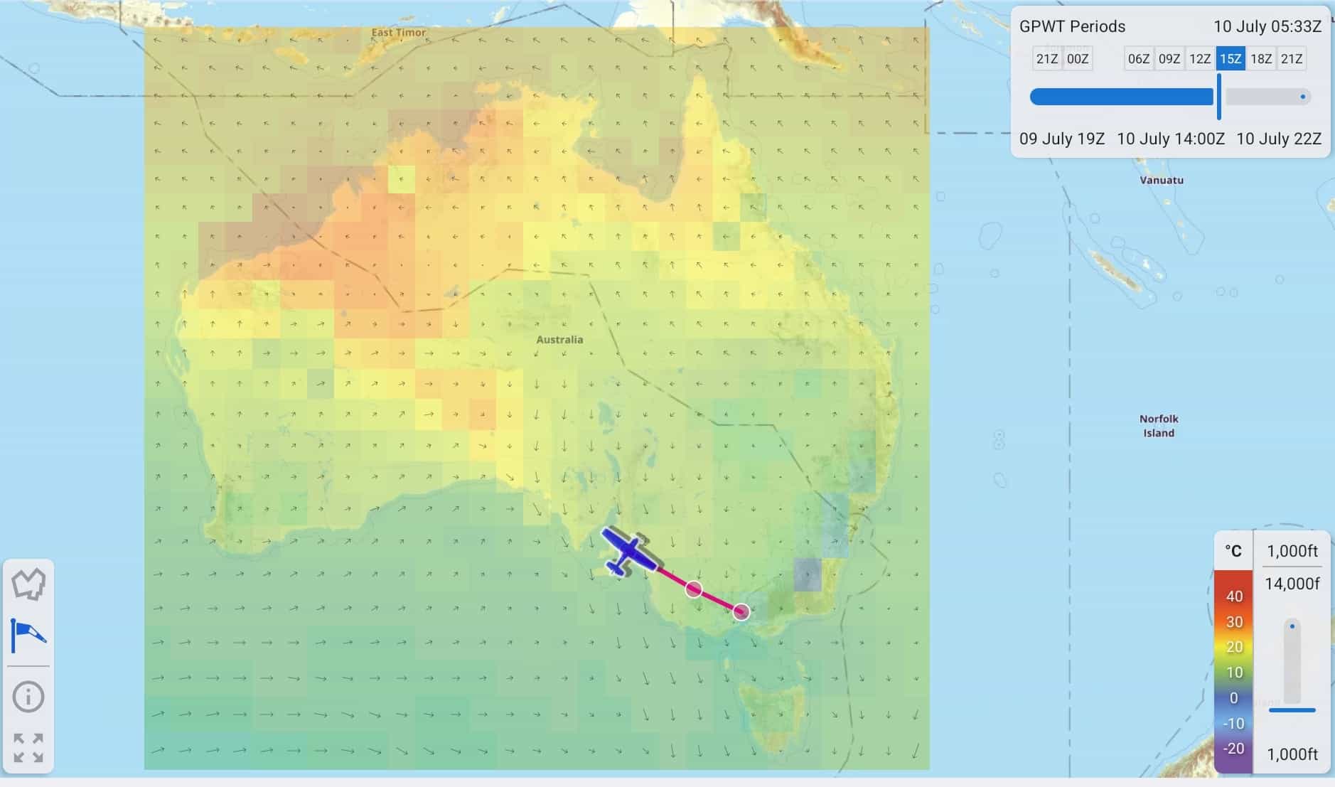
Image 5.9 GPWT in SmartBrief
These boxes give a graphical representation of the data from the GPWT charts. The colour indicates temperature (see colour scale in bottom left corner) and the arrow represents wind direction and strength, the longer the arrow the stronger the wind. Zoom in to see the actual figures for each grid square. The figures are interpolated for altitude and time.
Use the slider in the bottom right corner to adjust the altitude. As with the GAF, use the time slider in the top right corner to adjust the forecast time you want to view. The available GPWT periods are pre-filled in boxes so that you can easily switch between them.
5.8. Basic Brief
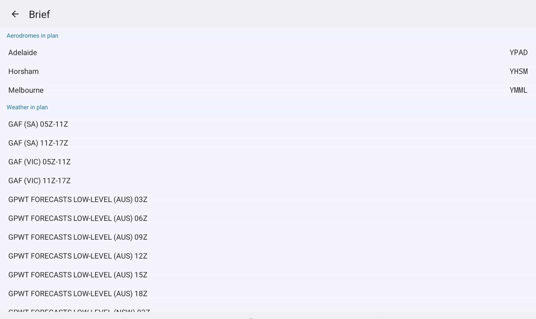
Image 5.10 Basic Brief
Basic Brief provides easy to access weather and NOTAM information relevant to your route in one place.
Aerodromes in plan
If you have a plan entered then all the airfields in your plan will be displayed at the top of the page. Tap an airfield to load the location briefing.
Weather in plan
The Weather in Plan section is only displayed when you have a plan entered. This section provides Area Briefings, GAF, and GPWT charts relevant to the areas your plan crosses. Tap an item in the list to view the chart or briefing.